

9 Surprising Facts About TV Test Pattern Origins
By Trivia Daily, Staff Writer — Published September 7, 2026
Table of Contents
- Key Takeaways
- The Fascinating Test Pattern Origins in Early Broadcasting
- The Indian Head and Other Iconic Test Pattern Designs
- How Test Patterns Actually Worked
- 9 Surprising Facts About Test Patterns
- Frequently Asked Questions
Before streaming services and 24-hour broadcasting, television stations signed off at night, leaving viewers staring at a curious geometric image: the test pattern. These hypnotic grids of circles, lines, and numbers weren't just filler—they were sophisticated engineering tools that helped technicians calibrate early television sets. The origins of test patterns reveal a forgotten chapter of broadcasting history, filled with innovation, artistry, and surprising connections to wartime technology.
What began as simple crosshairs evolved into intricate designs that became cultural icons. Discover the fascinating trivia behind these broadcast relics and explore why they mattered far more than most viewers ever realized.
Key Takeaways
- Test patterns originated in the 1930s to help engineers align and calibrate television equipment before regular programming began.
- The famous Indian Head test pattern, used by NBC and others, featured a photograph of a Native American to test skin tone reproduction.
- Different geometric shapes in test patterns served specific technical purposes, from measuring resolution to detecting signal interference.
- Television stations typically broadcast test patterns during overnight hours and before daily programming commenced.
- Modern digital television has largely eliminated the need for traditional test patterns, though they remain embedded in broadcasting culture.
- Some test pattern elements were borrowed directly from radar and military targeting systems developed during World War II.
The Fascinating Test Pattern Origins in Early Broadcasting
Television test patterns emerged during the experimental broadcasting era of the 1930s. Engineers needed a standardized way to adjust the complex electronics inside early television receivers, which required constant fine-tuning. The Radio Corporation of America (RCA) and other manufacturers developed patterns that allowed technicians to check horizontal and vertical alignment, focus sharpness, and aspect ratio accuracy—all critical factors when television technology was still in its infancy.
These patterns weren't arbitrary designs. Every circle, wedge, and line served a diagnostic purpose. The concentric circles helped adjust the roundness of the picture tube's geometry. Diagonal lines revealed distortion at the screen edges. Gray scales tested brightness and contrast levels. Test patterns transformed abstract engineering problems into visual puzzles that technicians could solve by turning knobs and adjusting circuits.
Broadcasting stations initially transmitted test patterns for hours each day. Engineers at the station and repair technicians in homes and shops relied on them to ensure televisions displayed images correctly. As television ownership exploded in the late 1940s and early 1950s, test patterns became a familiar sight to millions of Americans who turned on their sets before programming began.
The Indian Head and Other Iconic Test Pattern Designs
The RCA Indian Head test pattern became the most recognizable test card in American television history. Introduced in 1939, it featured a photograph of a Native American in traditional headdress surrounded by geometric patterns and gray scales. The human face served a crucial technical purpose: skin tones are notoriously difficult to reproduce accurately, and the portrait allowed engineers to calibrate flesh tones, which occupy a narrow band of color values.
The BBC developed its own distinctive test card featuring a young girl named Carole Hersee playing noughts and crosses (tic-tac-toe) with a clown doll. First broadcast in 1967, this "Test Card F" became so iconic in British culture that it aired for decades. The casual scene, photographed by BBC engineer George Hersee (Carole's father), provided realistic colors and contrasts for calibration while offering viewers something more interesting to look at than pure geometry.
Other countries developed their own variations. Germany used the Telefunken FuBK test pattern with precise geometric elements. Japan's NHK created patterns incorporating kanji characters. Each design reflected both technical requirements and cultural identity, turning utilitarian tools into inadvertent works of broadcast art.
How Test Patterns Actually Worked
Understanding test pattern origins requires grasping what they measured. The center crosshairs indicated the exact middle of the screen, essential for proper centering. Circles arranged around the pattern revealed whether the picture tube's electron beam scanned uniformly—distortion turned circles into ovals. Wedge patterns with increasingly fine lines tested resolution limits, showing how much detail the system could reproduce.
Gray scale bars, typically running vertically along one side, displayed a progression from pure black to pure white. Technicians adjusted the television's brightness and contrast until all steps appeared distinct. If the darkest bars merged into black or the lightest bars washed out to white, the set needed adjustment. This seemingly simple element prevented viewers from missing details in dark scenes or being blinded by overexposed highlights.
The frequency gratings—those mesmerizing patterns of fine parallel lines—tested the bandwidth of the television signal. High-frequency patterns revealed whether the transmission system could handle rapid changes between black and white. When these patterns began to shimmer, blur, or disappear, engineers knew they'd found the system's resolution limit.
9 Surprising Facts About Test Patterns
1. Test Patterns Borrowed Technology From Wartime Radar Systems
Many geometric elements in early test patterns came directly from radar targeting displays developed during World War II. Engineers working in television after the war adapted crosshairs, range circles, and calibration grids from military equipment. The technical overlap made sense—both technologies used cathode ray tubes and required precise alignment. This military heritage explains why test patterns often resembled targeting systems more than entertainment content.
2. The Indian Head Pattern Featured an Actual Photograph, Not an Illustration
The iconic Native American portrait wasn't a drawing or painting but a genuine photograph. The image came from a stock photo that RCA licensed for technical purposes. The choice of subject sparked later controversy about cultural representation, but at the time, engineers simply needed a high-contrast image with realistic skin tones. The headdress provided additional detail for testing fine pattern reproduction.
3. Some Viewers Watched Test Patterns for Entertainment
Before round-the-clock programming, insomniacs and early risers sometimes watched test patterns while waiting for broadcasts to begin. The steady, predictable image provided a strange comfort. Some people used test patterns as background ambiance or even meditation aids. Television repairmen occasionally discovered that customers had their sets tuned to the test pattern for hours, treating it as a peculiar form of video art.
4. Different Patterns Targeted Color Versus Black-and-White Sets
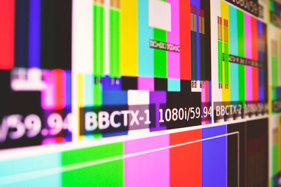
The transition to color television in the 1950s and 1960s required entirely new test patterns. Color bars became the standard, displaying pure red, green, blue, cyan, magenta, and yellow alongside black and white. These bars allowed precise calibration of the three color guns inside color picture tubes. Stations often broadcast both monochrome and color patterns at different times to serve viewers with different equipment.
5. Test Patterns Could Reveal Signal Interference and Weather Conditions
Experienced technicians learned to diagnose problems by watching how test patterns degraded. Ghosting—duplicate images slightly offset—indicated signal reflections from buildings or mountains. Snow and static revealed weak signals. Horizontal bars suggested electrical interference from nearby equipment. The test pattern functioned as a diagnostic tool that made invisible radio wave problems visible on screen.
6. The Monoscope Tube Generated Test Patterns Internally
Early stations didn't broadcast test patterns from cameras pointed at printed cards. Instead, they used specialized vacuum tubes called monoscopes that contained a photographically etched test pattern inside. When activated, the electron beam scanned this internal pattern, generating the video signal directly. This elegant solution eliminated the need for dedicated cameras and ensured consistent, stable test pattern broadcasts.
7. Test Pattern Broadcasts Helped Advertisers Plan Programming Schedules
The appearance of test patterns signaled to advertisers and viewers when stations would begin broadcasting. Stations published schedules showing when test patterns would appear and when programming would start. This predictability helped early television establish regular viewing habits. The test pattern essentially functioned as a "please stand by" message that told audiences something would happen soon.
8. Modern Test Patterns Still Exist in Digital Broadcasting
While traditional test patterns disappeared from most broadcast schedules, digital equivalents persist behind the scenes. Broadcasters use SMPTE color bars and digital test signals to calibrate equipment and troubleshoot transmission problems. These modern patterns serve the same fundamental purpose as their analog ancestors, though viewers rarely see them. They remain essential tools in television production and engineering.
9. Test Patterns Have Become Collectible Nostalgia Items
Vintage test pattern imagery now appears on t-shirts, posters, and artwork. The geometric designs evoke nostalgia for early television's analog era. Museums dedicated to broadcasting history preserve original test pattern cards and monoscope tubes. What once served purely technical purposes has transformed into cultural artifacts that represent a vanished era of television technology and viewing habits.
Frequently Asked Questions
Why did TV stations stop showing test patterns?
The rise of 24-hour broadcasting eliminated the overnight gaps when test patterns traditionally aired. Modern digital televisions also require less frequent calibration than analog sets, reducing the need for consumer-facing test patterns. Stations now use internal digital test signals that viewers never see.
What happened when a TV station went off the air after the test pattern?
After playing the national anthem and signing off, stations typically displayed a test pattern briefly before shutting down the transmitter completely. Viewers then saw only static—the famous "snow" caused by random radio noise. This dead air lasted until the station resumed broadcasting the next morning.
Can you still see test patterns on modern television?
Traditional test patterns rarely appear on broadcast television today. However, some cable channels briefly display color bars during technical difficulties or maintenance periods. Streaming services occasionally show error screens with geometric patterns that echo the test pattern tradition.
Did other countries use the same test patterns as the United States?
No, different countries developed unique test patterns reflecting their technical standards and cultural preferences. The BBC's Test Card F, Germany's FuBK pattern, and France's Mire designs all differed from American patterns. These variations resulted from different broadcast standards (PAL versus NTSC) and national broadcasting traditions.
Test patterns remind us that behind every entertainment technology lies an infrastructure of calibration, adjustment, and precision. These forgotten geometric ghosts of television's past performed essential work, ensuring that the images flickering across millions of screens appeared as engineers intended. Their disappearance marks not just technological progress but the loss of a shared cultural touchstone—that moment of anticipation when the test pattern finally gave way to the day's first program.